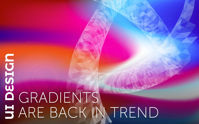
UI Design : Gradients Are Back In Trend
“Gradients are an amalgamation of scintillating colors to allure the viewers.”
After years of flat, content and completely minimal style, people have come back to the gradients. Everywhere you look, UI/UX designers are using color fades to add visual impact, create user engagement and just design something that creates an impression.
If you aren’t a fan of gradients, maybe it’s time to recheck your viewpoint on the issue. To help convince you, we’ve got reasons that will make you love and use gradients in your UI designs.
Gradients : Create Interests
A gradient creates visual interest and helps users move through the design. The eye will stand on the color of an area and will help to focus on the screen due to changes between hue and light and dark areas.
Gradients can be extremely useful and attractive design tools and can add sparks and intrigue to the crowd of projects. Despite the many ways to use components, one of the most popular options is the background, such as images, text, and other layers of it.
Gradients : Lettering Can Provide a Central Point
As the gradient can be used in the background, it can also be a foreground element. Color Gradient is a versatile technology that can contribute to their overall popularity.
Flip the use and you can use the foreground gradients to fill the letters on a clear background and focus on the word.
Color should be for choice purpose so that there is enough variation and the ability to read is retained.
Gradients : Overlays Adds Life To Dull Images
One color overlay can add extra interest on the image, which is a little bland. Gradient overlays are not a fix for a low resolution or poorly composed image, but it can give a more simple pop-up view.
With gradient overlays you can initiate designs, voice, tone and personality. Dazzling colors look a little different from the more available options.
When this technique looks very neat, it starts taking a little overhead. To make your design stand out, make sure to separate the full image, gradient over a bit.
Gradients : Create Something Significant
While gradients are becoming more popular, the fact that each color combination is somewhat different makes it significant for users. A deadly color combination can kill and create a user to help remember your brand messages.
Design gradients are used for purpose of helping to make that connection. What’s good about a good slope is that it becomes a color on its own. If you have a great slope to work with, then you use it in a different color in your brand palette to install Visual Connection. (Or use multiple elements in color.)
Gradients : Create Art when you are not a Strong Visual
A better gradient can create visual interest & displays when there is not much to create in it. Using some brightness in color or brand colors; can help establish your UI design presence.
Color changes are appealing enough that they can often standalone as a design element. Think about how you use, and select colors so that they create the right emotional pull for users and help them find the right feelings to associate with the content.
Even a delicate gradient can go a long way to setting the tone for a design.
Gradients : Easy to Create or Generate
Adding a gradient to the image or creating one from the beginning can be selected from two or three colors and then selecting a shape for the slope and where the colors should start, prevent and overlap.
Gradients are in shape, left to right, or above or below; Or radial, where color variation is generated from the same point in round fashion. Components in the design can contain one or multiple styles.
Picking colors for the slope can be the most difficult step. Using nearby colors on the color wheel will result in most complementary and natural ingredients. But that does not always have to work with you. In such cases, you want to play a little with colors so that you do not end up with a white color in the place where you can complete your primary color choices.
There a many tools available online where you can get help to create or generate gradients.
Final Notes
Gradients are an easy and extremely useful element that adds an astounding touch to the design. With many ways to use slope, it makes many sense that this can be your solution to your go. And when gradients have periodically declined in favor, they tend to return quickly due to the global fascination.
Recent Posts
Deep Learning Explained: Understanding the Brain Behind AI
The Intersection of AI and IoT: Creating Smarter, Connected Environments
The Evolution of AI: From Simple Algorithms to Neural Networks
The Role of AI in Sustainable Development
Scaling New Heights: Integrating Advanced Technologies in Startup Product Engineering
