How to Design: Gesture-Driven Interface?
As a UI/UX designer, you probably must remember the launch of Apple’s first iPhone as if it was yesterday. Among other things, it introduced a complete touch screen-centered interaction to individual’s most private and personal device.
Gestures became the new clicks
In today’s generation, children grow up with multi-touch screen experiences like it’s the most natural thing. Parents are amazed by how fast their children understand that how a tablet or smartphone works. This shows that touch and gesture interactions have a lot of potentials to make mobile experiences smoother and great fun to use.
How to choose Good (useful) Gestures
When it comes to espousing gestures into your designing, it is essential to know your market and other apps that your target audience can use. Try using related gestures in your application. In this way, you are not just optimizing your UI based on your target market behavior, but you are designing a more comfortable approach for users from the beginning.
Instructing Gestures
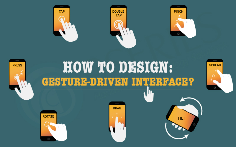
Gestures are crucial in every mobile app but it’s always a challenge to specify them for users. Touch interfaces provide many opportunities to use natural gestures such as:
- Tap
- Swipe
- Pinch
In contrast to graphical gesture based user interface controls, gesture-based interaction often hides from users. So, as long as the graphical users have prior knowledge that the signal does not exist, they will not try.
So the design for the discovery is crucial. You need to make sure that you will give the right signal-visual cryptography which helps users to easily find how they can interact with the interface.
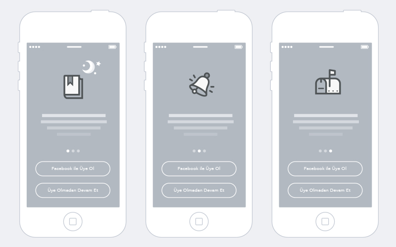
Continuing against tutorials and walkthroughs
Tutorials and walkthroughs for gesturing apps are a very popular practice. Tutorials included in your application in many cases means that the user should show some directions to explain the interface. However, the UI tutorial is not the most elegant way to explain the main functionality of the application. The main problem with upfront tutorials is that users need to remember all the new ways used in the app. A lot of information at the same time could lead to more confusion. For example, the specified application starts with a compulsory 7-page tutorial and users will have to read all the information patiently and try to send it to their memory. It’s a bad design because they need to work upfront in the app.
Teach in the context of action
When it comes to instructing users to use your UI, recommend doing this mainly by educating in the context of action (when a user really needs it). To teach people a new gesture you have to start slowly, following some revisions, suggestions can be gradually converted to search. Use only time-consuming tips to clarify every possible action in the user interface and insist on explaining one interaction. Indicate on gestures by giving clear, reference signs.
Animation – Communicate Gestures
Gestures which are useful are nothing without animation. As a professional app designer, you can use the animation to provide information about available actions. For example, to make users aware that they can interact with a particular component, you can create a text command on the interactive element and for example, you can animate the result of the interaction shown below.
Based on the use of animation, there are three popular techniques to help educate users as below:
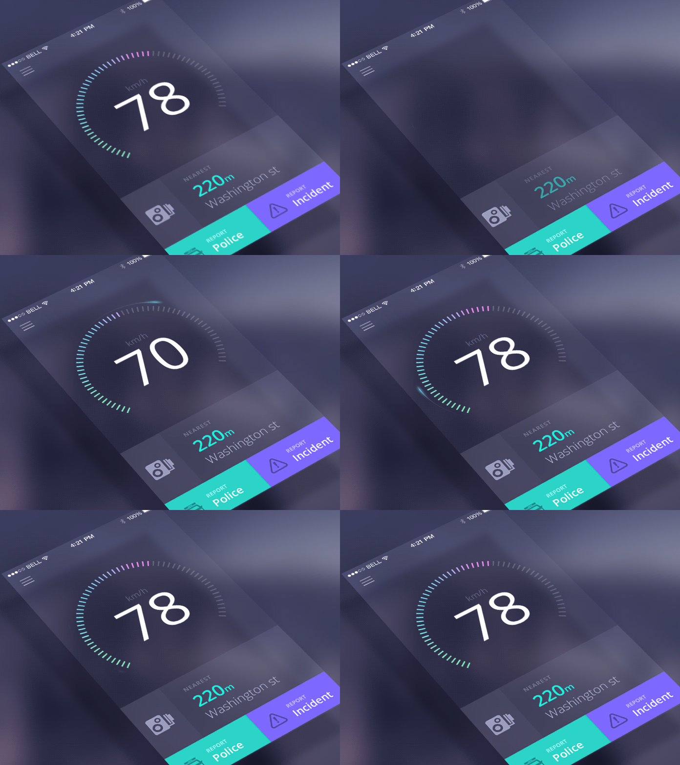
1. The first technique is a hint motion, or animated visual hint:
It aims to create organizations between the gesture and the action that it launches. For example, Animated Visual Hint mechanics are completely based on gestures, but it allows users to get basic thinking about what to do without estimating them. Gives information about animation functionality – A view is displayed with animation and it is immediately clear what users need to do.
Source by – 1stwebdesigner
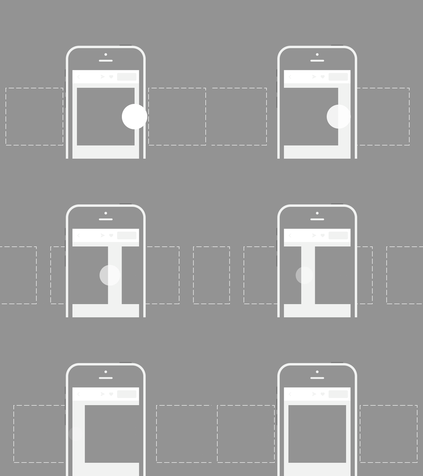
2. The second technique is a content teases:
The teases of the material are subtle and visual links shows what can be possible. One example below shows the thirst of content for the cards-it just shows that other cards exist on the back of the current card and makes it clear that swipe is possible.
3. The third technique is an Affordance:
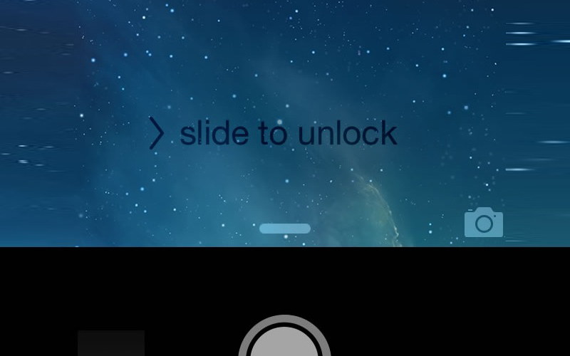
You can give some elements of your UI the highest attribute to point users to provide features to the interface and use bounce or pulse as the indicator of available gestures. An example of this technique can be found in Apple IOS. When a user destroys the camera icon, the lock screen flows down, the camera shows in the app below.
While it’s true that touch gestures are mostly invisible, there are many design techniques that give users as much gestures as possible.
We need to explore and comprehend the potential of touch and gesture-based interfaces and start thinking more in terms of dimension, time and animation.
Recent Posts
Deep Learning Explained: Understanding the Brain Behind AI
The Intersection of AI and IoT: Creating Smarter, Connected Environments
The Evolution of AI: From Simple Algorithms to Neural Networks
The Role of AI in Sustainable Development
Scaling New Heights: Integrating Advanced Technologies in Startup Product Engineering
