Development services have seen a dramatic turn of events in the last few years. In-house development services are now getting outsourced too, to avail maximum benefits. Outsourced development services have now carved their unique niche. A report by Statista states that the year 2018 generated a global IT outsourced revenue of $62 billion.
The shortage of workforce and modern technology in the local labor market are two main reasons for its growth. While creating a new product, outsourcing companies are capable of providing a professional experience. As technology advances, there is an increasing demand for creativity and expertise. And outsourcing provides exactly that.
It is extremely important to figure out when a company needs in-house software development and when they require outsourced services. In-house services require enough investment in infrastructure and resources. Plus, the company also...
Website Builders aren't great. Some are superior to others — and we unquestionably have a top pick (wink, wink). In any case, with everything their eye-catchy layouts guarantee, numerous miss the mark in what they really convey. Here are six reasons users hate website builders: 1. Codes They Have Are Tangled : Most website builders pay users' inconvenience to technical knowledge, which makes developers relentlessly filled with anger and nausea. Their software allows users to treat the online aspects in any outdated shape in the design applications: just draw it and slap it anywhere (aka, fully positioned). Sadly, this is how the online world works. And the result is non-linguistic nonsense, that is cloaked in many departments and category names, which are machine-created drivels. But with the website development - instead of throwing an element anywhere on the canvas - you have to work with a box version, not against it. you've got...
Celebrate Christmas with 9series Solutions and boost your business in 2018. Christmas, an auspicious festival where one loves to spend time with family and friends as well as want to make sure business remains uninterrupted. There are lots of Christmas offer around from ecommerce websites and local stores. You may find some best Christmas offers as well as some froud. Here @9series, we have best christmas offers to you for your end to end mobile app development services and responsive website development services requirement. Whether you are having an existing mobile app, want to enhance it, add new features or upgrade it to next level with superior UI/UX, create a new mobile app POC/MVP for 2018 business plan, design mobile app wireframe for your new startup or want to create mobile app APIs or web portal. 9series is a perfect match for you and one of the top...
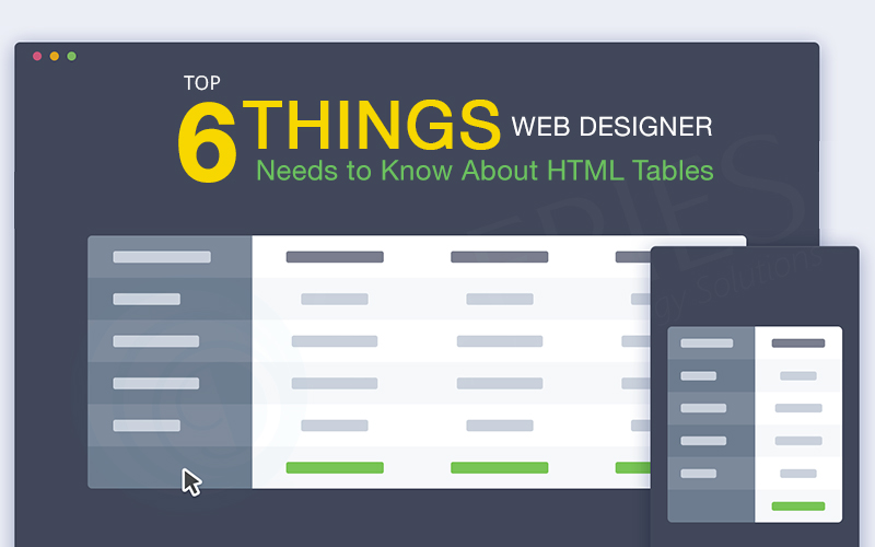
HTML tables have already come since long at the time of web. It may be surprising that some web designers have never worked with this element. In this article, our best graphics designers will discuss what you need to know about tables. We'll start with basic syntax and semantics. Then, we will attempt to respond to our tables. So, let's begin with this article in points of interest.
Basic HTML Table
Which are the essential elements in each HTML table? You need a table, i.e. tr and td elements. Well, these are the elements that define the table. Next, tr allows you to define a row within a table. Finally, td defines a cell in the row, so the table element at the top level will be inside. There will be one or more tries and, within it, there will be one or more...Single-Page Applications (SPAs) are Web apps that heap an individual HTML page and progressively redesign that page as the user communicates with the app. It is also known as Single page application. Microsoft’s MSDN informed us that SPAs use AJAX and HTML5 to create fluid and responsive web apps, without constant page reloads. On traditional websites, when visitors click on the links, these links generally lead to a new URL and load an entirely new page. In SPAs, the whole page doesn’t reload; instead, certain content is changed, loaded, and swapped out within the same page. Microsoft’s MSDN informed us that in an SPA, after the first page loads, all interaction with the server happens through AJAX calls. These AJAX calls revert data - not markup - usually in JSON format. The app utilizes the JSON data to modify the page actively, without reloading the page. Applications are...
Remember the time when smaller mobile phones were fancy and had small screens? Well that time has gone! A smartphone having a screen which is standard in size between that of a smartphone and a tablet computer. The word itself speaks: phone + tablet = phablet. So these are mobile phones that are way bigger. More specifically, the screen size of these devices typically extends between 5 inches to 6.9 inches. In the last ten years, smartphones have changed their shape, size and design. Since Apple changed the “evolution” of the mobile phone with the iPhone release, smartphones have grown rapidly and are followed behind large screen phones “Phablets” that have expanded its market presence rapidly. We can say that screen sizes have been an issue for quite a while before the iPhone with phone manufacturers producing phones with bigger screen sizes are compressed into small Containers since 2001. Apple...
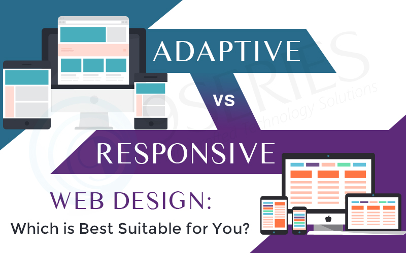
The world of web design has changed significantly over the years and continues to emerge as mobile-friendly design becomes more about the law rather than the exception. When it comes to choosing the right design for your website, 9series keeps in mind the number of aspects to choose along with style, typography, imagery, UI/UX, performance and online appraisement just to name a few. Sites were created with fixed dimensions and were intended to be seen on a desktop screen only. Now there are variations based on this original idea to make room for the arrival of mobile users. Your users are demanding to view your site - not only on a computer screen - but on a tablet or a mobile phone. As a result, two popular identifications for web page design are introduced and they are responsive & adaptive design. While each of these web designs have similar...
When people think about setting up a great website, they often imagine a modern and appealing design with a professional layout. But while looks are definitely important for a website, it’s crucial not to neglect another significant element – the website’s usability. As the visitor is the only one who clicks around and hence makes all the decisions, a user-centric design has become a standard approach for efficient and conversion-oriented web design. After all, if visitors can’t use a feature, it might not exist well. Web site usability is very important for any website. Clients should have quick, easy and friendly access through the website. This is important in ensuring that your customers remain loyal without finding alternative sources. To achieve the above, these factors should be taken into consideration while designing your website. Put the Good Stuff Internet users "read" web pages like they...
Responsive Web Design gives absolute adaptability to virtually any device. It makes website dynamic, which is necessary for all modern websites. As a matter of fact, statistics show that most websites will be viewed on mobile devices in the coming future, so going responsive is the answer to coping with that.
It has helped content marketers evolve and develop much more engaging content experiences by doing such thing that sounds easy; however one need to put efforts wisely to displaying the same content differently across devices effectively. According to Marketingexperiments, device adaptive design strategies benefited major businesses in increase conversions by 56%. While implementing responsive design is challenging, as many developers and publishers are still struggling to adapt their content to different layouts, there are rising technologies which they can leverage in order to give consumers a seamless experience.
2016 brings a few new...